
With 2M users in 189 countries, Shine’s mission is to make wellbeing accessible, affordable, and representative. The team wanted a “visual refresh” for their iOS app (one of App Store’s Best of 2018 for self-care) and hired me to do a series of explorations.
FREELANCE DESIGN & ILLUSTRATION / SHINE TEXT, 2018
visual refresh
The design team was relying heavily on stock photos for the audio track images used in the Shine iOS app. Drawing inspiration from other apps in the mindfulness space, they wanted to see if there was a way to incorporate illustration and graphic elements. The goal of the project was to give designers more flexibility, as well as some own-able brand assets to use across social media and marketing campaigns.
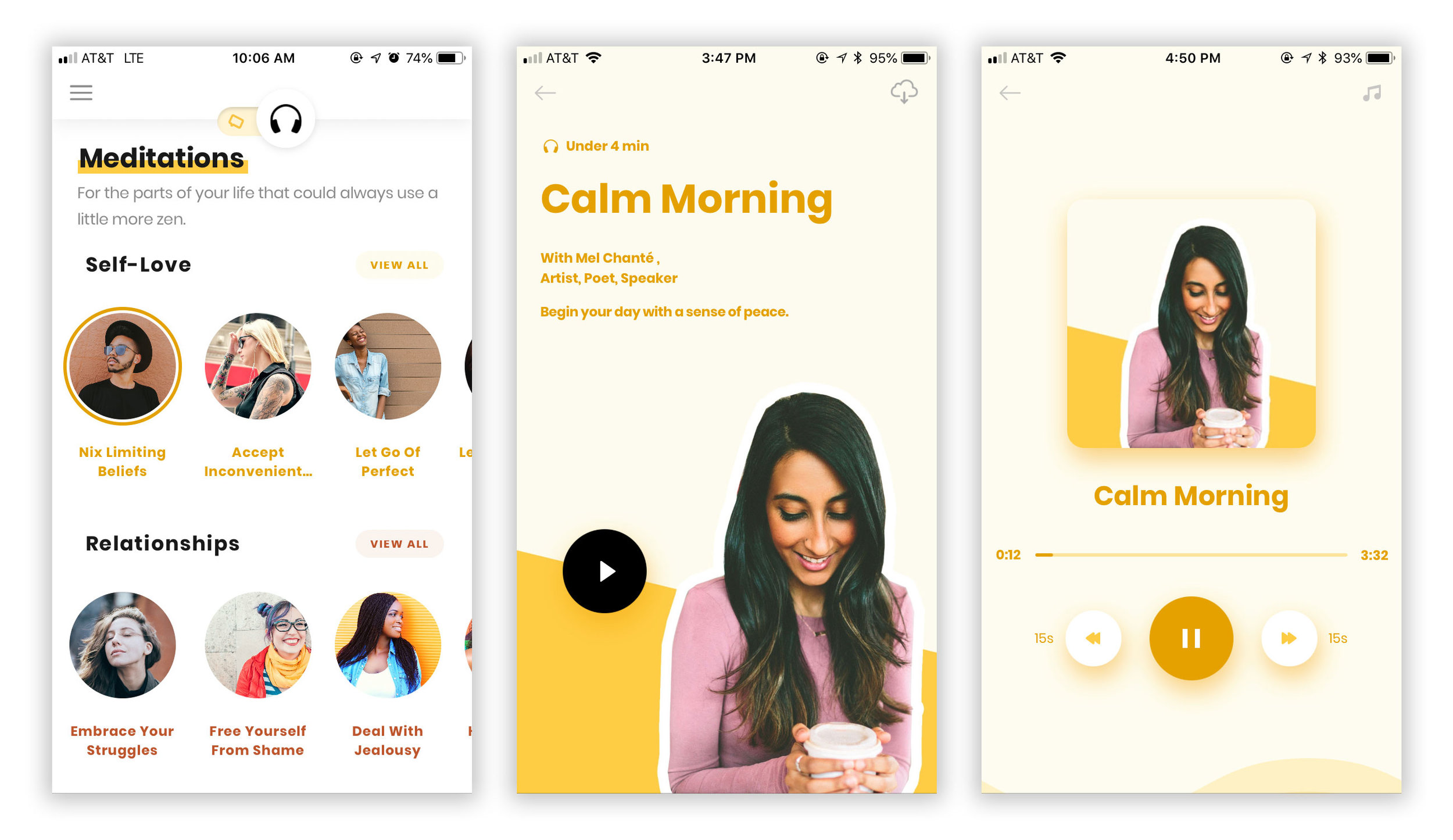
Shine iOS app existing design (left to right: track library, track description, track player), October 2018
In my initial explorations, I tried to move away from stock photos completely, and created custom illustrations inspired by the app’s content. I also opted for a square tracks (similar to the one used on the player screen) because the circular ones resembled profile pictures.

Proposed visual refresh, Round 1
My drawing style is a little rough around the edges, which I thought paired well with the clean lines used in the background. (For the purpose of these mocks, I only created a few illustrations and repeated them.) Although the vector illustrations would allows us to play with color, opacity, size, and rotation, we ultimately felt that this approach wouldn’t be scalable. It would also be challenging to translate each track’s theme to something drawable.
For subsequent rounds, I experimented with more abstract doodles that could be used in tandem with stock photos to make them feel more branded.

Proposed visual refresh, Round 2
With Round 2, I suggested keeping the text and player controls in the same position on both the description and player pages, to allow for a smoother transition between states. I created a set of doodles for the player background, which were admittedly too frenetic for a mindfulness app. My biggest struggle, however, was establishing a relationship between the graphic elements and stock images used across the track library. This iteration felt way too disjointed and busy.
My final explorations included a set of shapes that could be anchored to the sides or corners of the track covers. Each shape had 4 possible positions. This system worked better with stock photos, since it was more flexible and could support tighter shots, as well as wider ones.

Proposed track overlays

Proposed visual refresh, Round 3
In contrast with Round 2, I kept the player pages simple and distraction-free. I explored using tints and shades of a single color vs. using a combination of bold colors.
COLOR PALETTE refresh

Existing Shine iOS app color palette, October 2018
The existing color palette was fairly muted. While the colors certainly evoked calmness, which seemed appropriate for a self-care app, we wanted to explore a bolder and brighter palette that better aligned with the fun spirit of the Shine brand.
I worked with Mia Lavimoniere (Shine’s Senior UX Designer) to move in a more modern, high-contrast direction and ultimately settled on six primary colors, with a secondary set of tints and shades.

Proposed Shine iOS app color palette

Shine Instagram and track library, January 2019
final thoughts
Working for a mission-driven company is always a special experience, and Mia and Marah (Shine’s Co-Founder) were particularly wonderful throughout, providing thoughtful feedback and clear direction. While we didn’t land on a final solution, I believe the explorations served as a good jumping off point as the design team continues to evolve the app and overall Shine brand.