
Stareable | Creator Onboarding
In June 2018, we revamped our creator onboarding process. The new design reduced confusion, increased show submissions, and gave creators more control over their show’s discoverability.
All information in this case study is my own and doesn’t necessarily reflect the views of Stareable.
project type
Desktop Web, Mobile Web
team
John Langhauser (back-end developer), HaiChen Song (front-end developer)
my role
Ideation, research, product specs, prototyping, user testing, UI/UX design
FIGURING OUT OUR “NORTH STAR”
While initially conceived as a destination for web series discovery, Stareable gained much of its early traction with the web series creator community. We determined that it made more sense to target the supply side of our platform, giving our most active users (content creators) a reason to bring their fans to Stareable.
With that in mind, we set out to design the best experience for creators, both online and IRL. If a feature didn’t directly support our creators, it wasn’t a priority.
Assessing the first mile of the product experience
The show submission process is often the first opportunity for us to demonstrate our value to web series creators, and establish ourselves as a reliable, intuitive tool for getting discovered online.
One of the earliest mistakes we made was overlooking the importance of building a user-friendly content management system. Only creators will see the back-end, we assured ourselves. Once we became laser-focused on the creator experience, we realized that the so-called “back-end” was critical for successful conversion.
At the time, our site lacked a clear CTA for submitting a show (it was hidden in a dropdown!), despite “show submissions” being one of our key growth metrics. Even if someone figured out how to submit, the process itself left something to be desired:

Creator onboarding, 2017
I started off by doing a walk-through of the current experience and taking notes along the way. I found the onboarding process to be confusing and unnecessarily complicated. My sentiments seemed to resonate with our users: we frequently received emails from web series creators, asking for help in navigating show submission. As such, we decided that one of our key success metrics would be a 75% decline in confused user emails upon launching the new CMS.
In addition to being more intuitive, we wanted the new design to encourage creators to provide as much information about their shows as possible. The more data we have, the more searchable and discoverable their shows become. And the more discoverable their shows become, the more valuable Stareable becomes. Win-win! 🙌

Browsing by tag on Stareable
Since our UI encourages browsing by tag, shows with tags are more likely to be discovered. Therefore, we decided to make tags a required field moving forward. However, we already had thousands of shows on the site and the vast majority lacked tags. This led us to define another key success metric: 75% of all shows tagged within two months of launching the new CMS. With an effective design, we were hoping to drive creators to edit their incomplete show pages.
With these goals in mind, I set out to re-design the existing CMS, while also adding new features, such as a dashboard to display show engagement stats.
creator onboarding
The easiest “win” for us was adding a prominent “Submit a Show” CTA to the main navigation bar for anyone who is logged out, or has yet to submit a show to Stareable.

Nav bar states (top to bottom): logged out, logged in/non-creator, logged in/creator
Initially, we had required people to “request to submit” so we could confirm that their shows met the Stareable criteria. However, this process was manual and redundant, since they would have to submit again once we gave them access to the CMS (and then we would have to approve again).
To streamline the task, we added this simple modal that appears upon clicking “Submit a Show” in the main navigation bar:
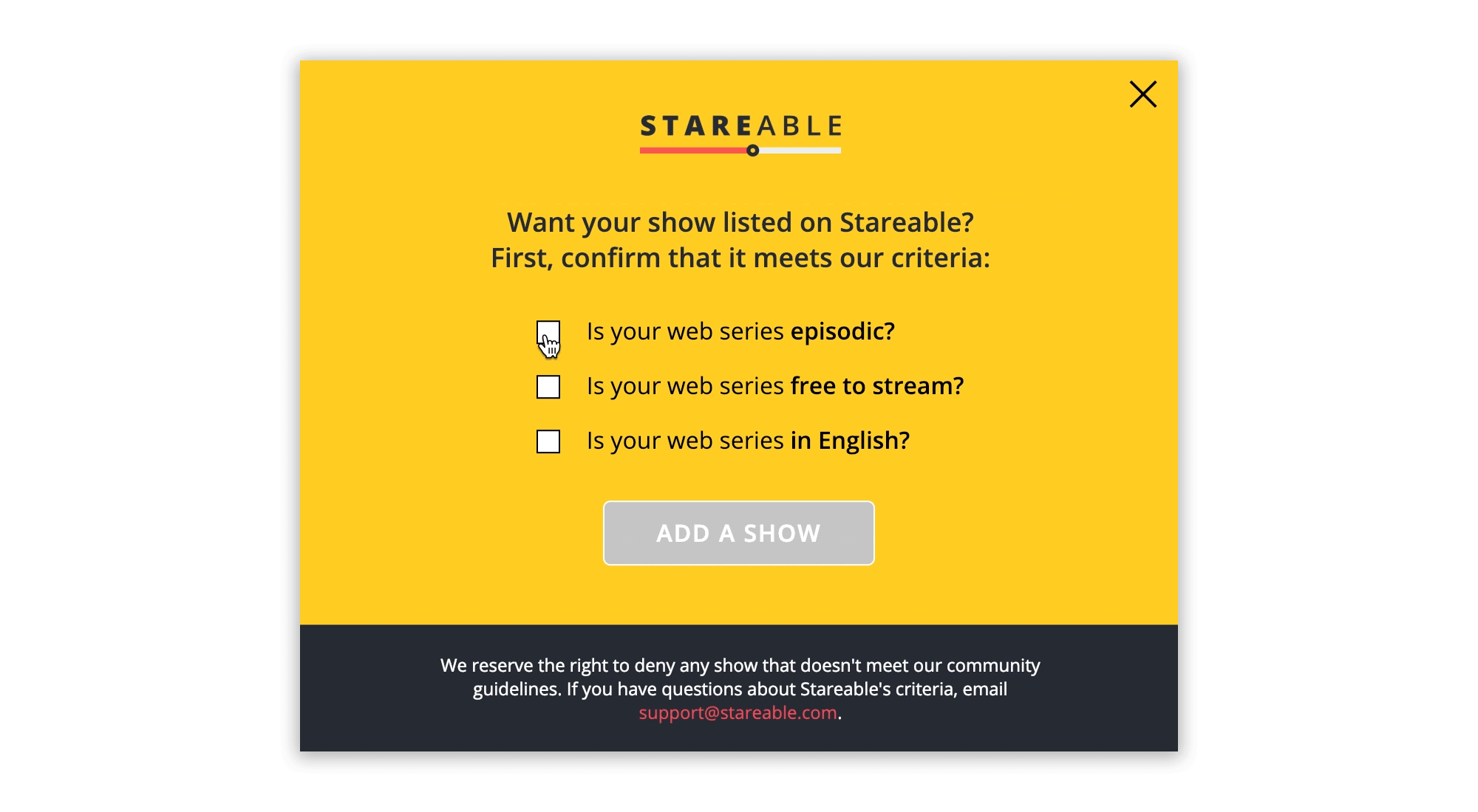
By forcing creators to acknowledge our submission criteria, we were able to set expectations and reduce the amount of non-eligible shows that ended up in our approval queue.
When a user hits “Add a Show,” they are forced to log in (assuming they are logged out) or create an account—once they do so, we designate that account as a “creator account” moving forward. This designation allows us to send creator-specific transactional emails and add creator-specific features to the platform.

Reducing friction in the show submission flow
Once creators confirm their show’s eligibility, we open the gates to our new onboarding wizard. Rather than overwhelming creators with a million input fields all at once, we divide the experience into stages. The progress bar references our logo, adding a bit of delight:
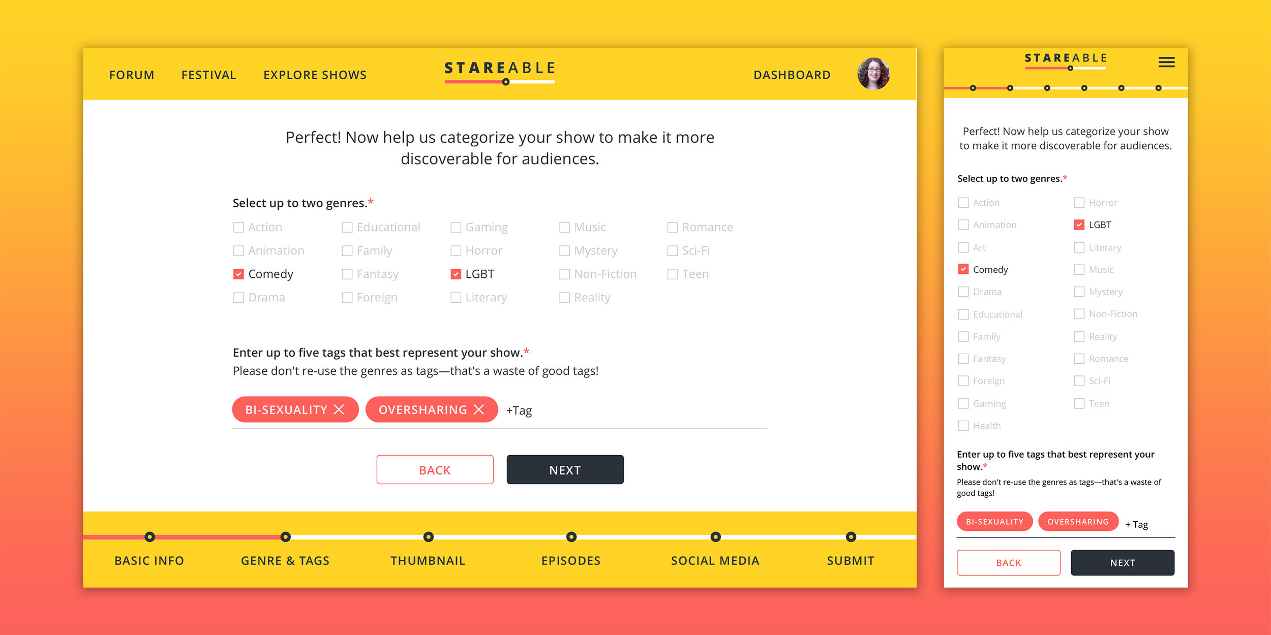
Creator onboarding, June 2018
Not only did the new show submission process decrease the amount of “help!” emails we received, but we also noticed a significant spike in shows added, week over week—a testament to our efforts to streamline the user experience.
CREATOR DASHBOARD
At this point in our product journey, we were struggling with recurrence and the creator dashboard was one of the strategies we employed to get creators to keep coming back to Stareable.
We had been sending creators their show stats via email on a weekly cadence. I proposed making show stats accessible on our platform, where they could be interactive and dynamic. The team was aligned, so we put an end to the weekly reports and began developing our creator dashboard as part of the creator “back-end” (ie. content management system). Not only would the onboarding experience culminate on the dashboard page, but all subsequent sessions would begin there.
After creating a set of mocks and workshopping them with the team, I built out a dashboard prototype for user testing. Bri, Stareable’s Community Director, scheduled sessions with several web series creators and we met them at our local coffee shop over the course of one week.

Creator dashboard, July 2018
The first iteration of the creator dashboard (above) displayed all the stats in a table. I drew inspiration from various analytics dashboards, but wasn’t satisfied with the outcome. The table was tricky because we would have to resort to horizontal scrolling if and when we decided to add more columns. Overall, the execution felt a little too serious and slightly intimidating—not exactly “on-brand” for us.
The next iteration (below) felt like a step in the right direction, featuring expandable panels that housed data sets pertaining to the selected show. (Since many creators on Stareable own multiple shows, we added a dropdown menu, rather than displaying metrics from ALL shows in a single table.) During user testing, we found that people preferred this “friendlier” dashboard. It’s also much more scalable, since we can continue stacking panels (and customizing the design of each one, if needed) as we build more tools.

Designing the various dashboard states

Creator dashboard, December 2018
One of our user testers referenced LinkedIn’s “Profile Strength” bar as an effective incentive to fill out as much information as possible. We loved the idea, and incorporated a “discoverability” meter that indicates the robustness of each show profile. We came up with a formula by assigning a value to each component of a show page. An incomplete profile decays discoverability, which we communicate via dashboard notifications. This was another way for us to remind creators with existing, untagged shows that they should add tags to boost their discoverability.
final thoughts
As an early stage startup with limited resources, we couldn’t spend a ton of time iterating and testing multiple designs. We had to move at a pace that I was less than comfortable with, but as a result, I learned to let go of my perfectionism and prioritize. I would have loved to incorporate custom animations to make the onboarding experience more engaging, as well as more personality-driven copy. Once we accumulate more user data, I would also like to include tips and data-backed best practices, such as: Shows with 4 or more tags are 60% more likely to be discovered!
As we continue to add new features, we will have to revisit onboarding to help familiarize creators with our growing suite of tools. While the solution we shipped effectively leads users from point A (show submission) to point B (creator dashboard), I know there’s a lot more we can do in terms of generating excitement and highlighting everything that makes Stareable unique.
but wait, there’s more
In April 2019, we released another iteration of our onboarding flow. We found that there was a common misconception that adding your show to Stareable will automatically result in more views. With this new version, we wanted to clearly communicate that Stareable is not a discoverability platform, but rather a tool for audience-building.
The main changes included:
Replacing the Submit modal with a page that matches our Log In and Sign Up pages.
We also revised some of the copy to reduce potential anxieties, making it clear that our creators retain full ownership over their content.

Show submission criteria
Adding a welcome page, sandwiched between the “Submit” page and the onboarding wizard.
We paired the copy with visuals that explain the value of joining Stareable and accessing our tools.

Onboarding welcome
Simplifying copy, adding inline error states, and improving tooltips.
We also anchored the progress bar below the header (it was previously anchored to the bottom of the page) to ensure that it’s always visible above the fold.

Onboarding wizard, errors and tooltips
Adding a dynamic preview of the show profile page, for creators to review before submitting.
We made sure to include the Episodes/Updates/Cast & Crew tabs in the preview, to hint at everything that’s left to explore after submitting.

Onboarding wizard, last step
Instead of driving creators to their dashboard post-submission, we adjusted the flow so that they end up on their show profile page, which won’t be public until their show is approved.
The page defaults to the “Updates” tab, driving users to schedule their first update, while waiting for their show to be approved.

Show profile, pending approval
Replacing the "discoverability meter" with a checklist that indicates page strength.
We hoped this would clear up the misconception that profile automatically yields discoverability.

These onboarding changes, in addition to some smaller tweaks, resulted in a sharp increase in show submissions, as well as an increase in updates scheduled/published by new creators.